CSS 101
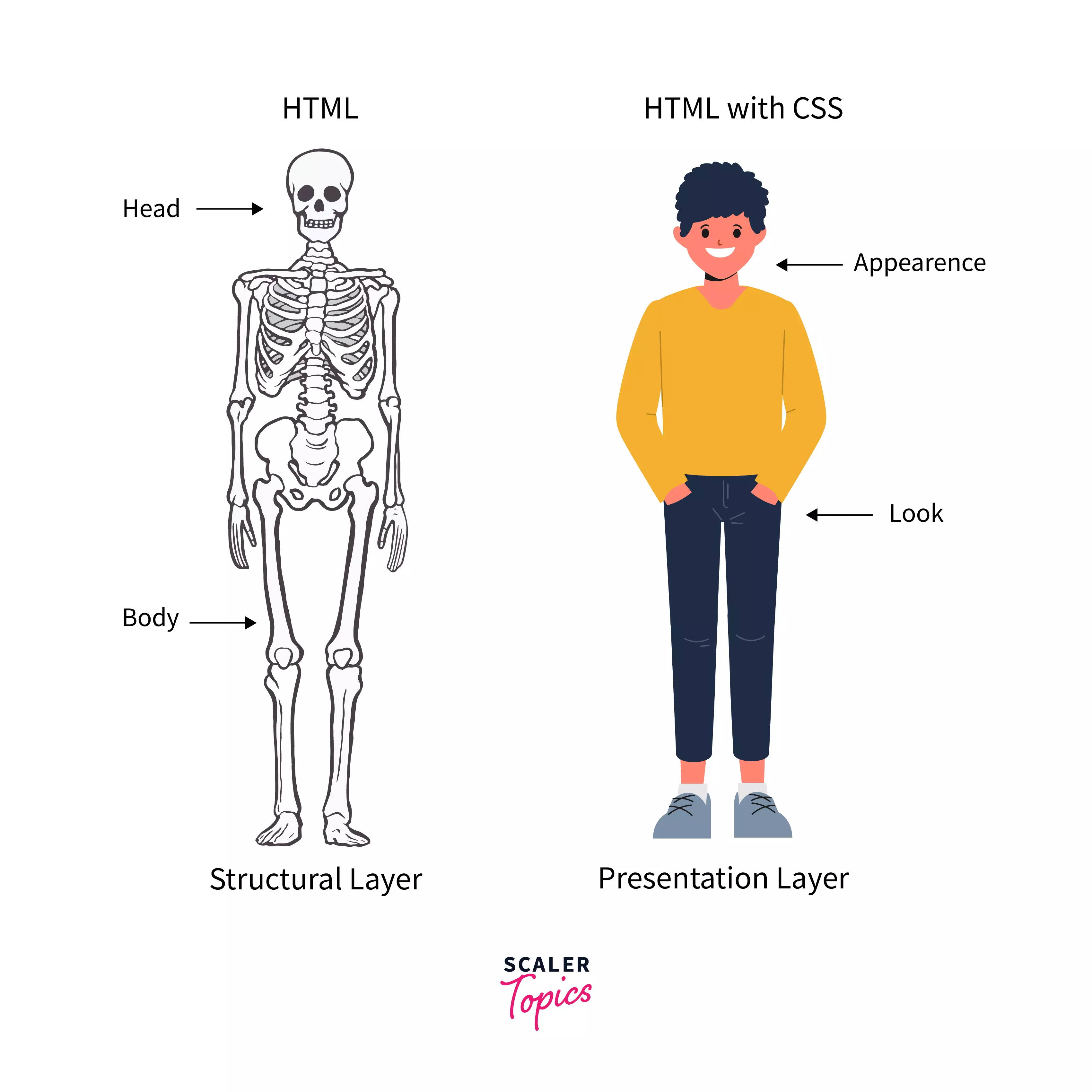
Image Credit: Scaler Topics
CSS (Cascading Style Sheets) is the code that styles web content. CSS uses rulesets to select and apply styles to HTML element(s). The following figure shows the anatomy of a CSS ruleset.
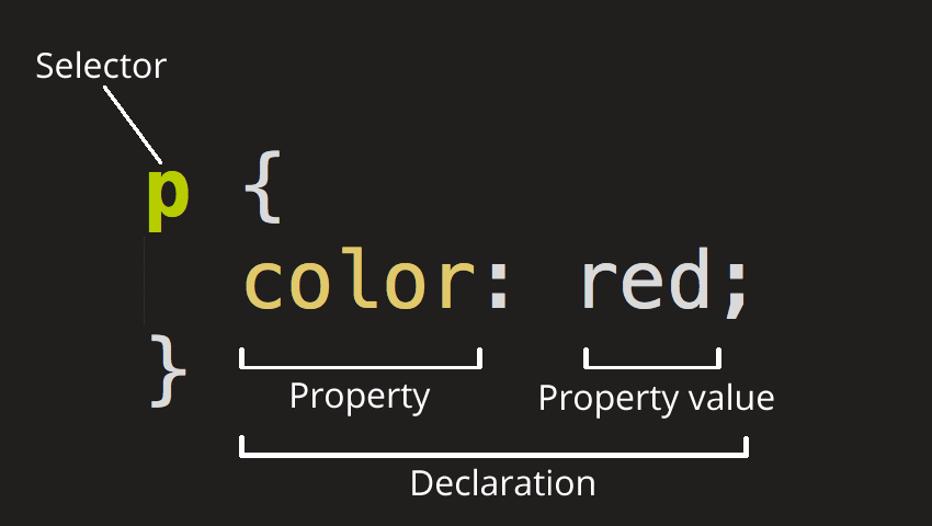
Image Credit: Mozilla
Linking CSS to HTML Documents
There are basically 3 ways to add CSS to webpages:
External
External (also the most common one) is when you have a separate CSS file (or files). We link external CSS files to webpages using the <link> element inside the HTML head element.
<link rel="stylesheet" href="mystyle.css" />
Internal
Internal is when styling happens inside HTML files (rather than separate files). It is also common to add interal CSS inside the HTML head element.
<head>
    <style>
        body {
        background-color: #f1f1f1;
        }
        p {
        text-align: center;
        }
    </style>
</head>
Inline
Inline is when we add styling directly to HTML elements.
<p style="text-align:center">This is a test</p>
In terms of precedence, here is the order:
- Inline
- Internal
- External
That means, in case we have External, Internal, and Inline styling for an element, the Inline styles win. It’s a best practice to only stick with one method (Internal, External, or Inline) to avoid conflicts. Also, as mentioned above, External CSS is the most common approach, as it keeps our project clean and provides separation of concerns.
Note: There is another way to add CSS to a webpage and that’s called CSS in JavaScript. We will get to that later in the course!
Adding CSS to HTML Elements
In order to add styling to HTML elements, you first need to select that element. There are 4 main ways to do that:
- by tag name
- by tag id
- by tag class
- by attribute name
Each of these methods have their use cases, and based on different scenarios one of them would make more sense to use.
For example, if you need to apply the same style to every <p></p> element, choose styling by tag name:
p {
  text-align: center;
  color: #444;
  padding: 10px 5px;
}
However, you may have a situation in which you need to apply these styles to a group of <p></p> elements, but not all of them. In this case, it makes more sense to use styling by class.
<p class="center-aligned">...</p>
<p class="center-aligned">...</p>
<p class="center-aligned">...</p>
<p class="right-aligned">...</p>
<p class="right-aligned">...</p>
p.center-aligned {
  text-align: center;
}
p.right-aligned {
  text-align: right;
}
Also, you will run into sitations where you only need to apply styles to only one element. That’s when styling by id would make more sense.
<p class="special-p">...</p>
<p class="center-aligned">...</p>
<p class="right-aligned">...</p>
p#special-p {
  color: blue;
}
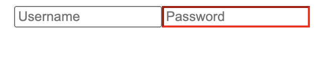
You can also select an element using its attributes:
<input type="text" placeholder="Username"/>
<input type="password" placeholder="Password"/>
input[type="password"] {
  border-color: red;
}
CSS Specificity
In case of conflicts, browsers adhere to a set of rules to find the winner. These rules are called Specificity. Basically, the more specific and detailed style wins the battle. CSS specificity can get really complicated and there’s actually a way to calculate the specificity of an style. Here’s the simplified version of the rule (it could get more complicated than this):
Start at 0, add 1000 for
styleattribute, add 100 for each ID, add 10 for each attribute, class or pseudo-class (such as:hover), add 1 for each element name.
For instance, which style do you think wins the following conflict?
div#some-id {
  color: black;
}
div.some-class {
  color: blue;
}
Since selecting an element by ID is more specific than selecting by class, the first style wins. In terms of actual weight in numbers, the first one has the weight of 101 (one tag name and one id) and the second one 11 (one tag name and one class).
When two or more styles have the same weight or specificity, the one that comes later wins.
div.some-class {
  color: blue;
}
div.some-class {
  color: black;
}
Since the second style appears last, it will win the conflict.
You can also mark a declaration with the !important keyword and give it the highest precedence. Other declarations would only be able to compete if they also have been marked with !important:
div#very-specific {
  color: red;
}
div {
  /* this will win */
  color: red !important;
}
div#very-specific {
  /* this will win */
  color: red !important;
}
div {
  color: red !important;
}
Flexbox
Flexbox is a layout method for arranging items in rows and columns. It’s become very popular because of its ease of use and compatibility.
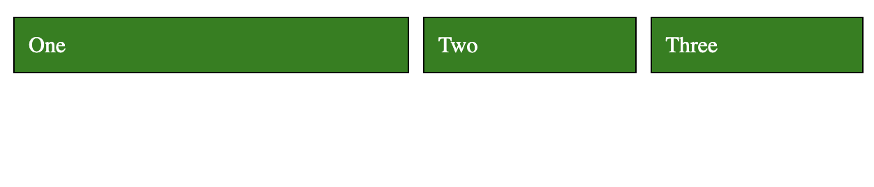
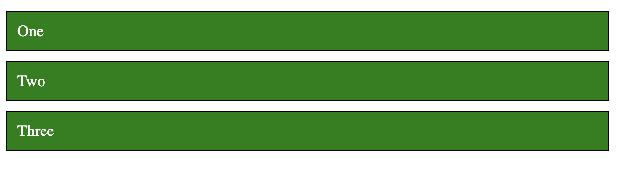
Let’s start by a simple example:
<section>
  <div>One</div>
  <div>Two</div>
  <div>Three</div>
</section>
div {
  background-color: green;
  margin: 5px;
  padding: 10px;
  border: 1px solid black;
  color: white;
}
This will results in 3 blocks stack one another:

To make them line up in one row and three columns with equal widths would be a rather challenging task in traditional CSS (using float). But with Flexbox, it’s very easy.
First, add display: flex to section (parent), and then add flex: 1 for divs:
section {
  display: flex;
}
div {
  background-color: green;
  margin: 5px;
  padding: 10px;
  border: 1px solid black;
  color: white;
  flex: 1;
}
And that’s all we need:

display: flex makes the children inside section flexible so they can share the same line together. flex: 1 is the ratio of space each div will take. When they all have the same ratio, they take up the same amount of space. If we give the first div 2 for flex it will take up half the space, and the other two will share the other half:
div:first-child {
  flex: 2;
}
Now, let’s center all the divs without stretching them to fill the line:
section {
  display: flex;
  justify-content: center;
}
div {
  background-color: green;
  margin: 5px;
  padding: 10px;
  border: 1px solid black;
  color: white;
}

Flexbox has two axes: main and cross. justify-content aligns items (children) along the main axis.

Image Credit: Medium
Here’s the visualization of the different options for justify-content:
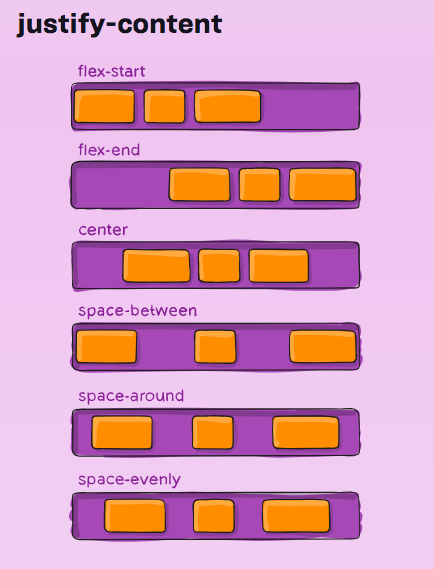
Image Credit: CSS Tricks
We can also change the default direction (row) to column so the divs appear on top of each other:
section {
  display: flex;
  flex-direction: column;
}
Note that the direction of the axes has now changed. main is now vertical and cross horizontal. So, justify-content won’t align the items horizontally anymore; it will align them vertically.
To align items along the cross axis, we use align-items.
section {
  display: flex;
  flex-direction: column;
  align-items: center;
}

Flexbox has more properties that you can play around with. Check out this fun game to practice.
Responsiveness
A webpage is responsive when it shows properly on all screen sizes. This usually means the layout has to change in some way to adjust itself to the new screen size.
In CSS, we can apply different styles to elements based on the screen size using media queries. For example, the following example shows how we can style a div with the id content when the screen size is 800px or smaller:
/* default padding */
div#content {
    padding: 30px;
}
/* you can also use "min-width" or a combination of both: */
/* @media only screen and (max-width: 800px) and (min-width: 400px)  */
@media only screen and (max-width: 800px) {
  /* padding only if screen is 800px or smaller */
  /* this has a higher precedence and wins the default padding when */
  /* the condition is met */
  div#content {
    padding: 10px;
  }
}
The div element will have a padding of 30px when the screen is 800px or smaller, and 30px otherwise.
As mentioned before, we are going to use a CSS framework that will take care of all these for us, but it’s good to know what is happening behind the sceen.
CSS Frameworks
It usually takes a significant amount of time to write all the CSS of a website from scratch. That’s why CSS frameworks are so popular nowadays. A CSS framework is a set of predefined styles ready to get applied to your HTML. Instead of writing your own CSS, you would simply assign predefined CSS classes from a framework.
Aside from the fact that you would save a huge amount of time by using a CSS framework, it would also make your website more robust, as CSS frameworks have been tested against all major browsers and do not contain common mistakes. More often than not, they are open source projects, which means there are houndreds, if not thousands of people contributing to these projects. So, it really makes sense to start with a CSS framework for your website.
Among most popular CSS frameworks, here is a short list: